-
Architects: Javier Martínez Medina
- Area: 35 m²
- Year: 2016
-
Photographs:Jon Alkain Zendoia
-
Manufacturers: Pladur, http://vascoplast.com/, http://www.maderaszubizarreta.com/

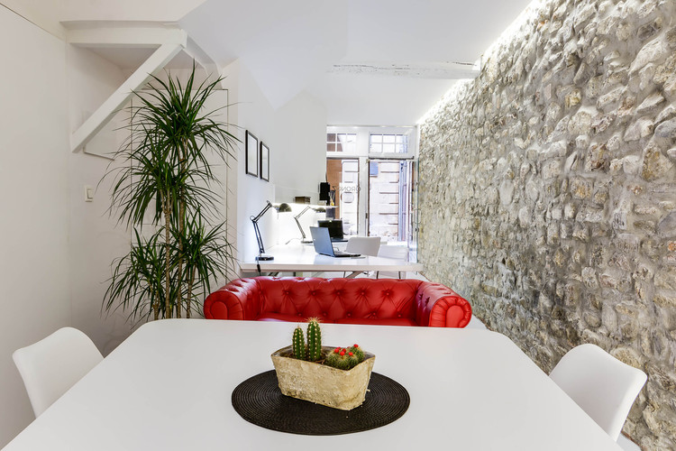
Text description provided by the architects. This project was created with the aim to respect the tradition but keeping the XXI Century spirit. From the beginning we thought that it was fundamental to defend the values and essence of the client as laywer from the historic center of Hondarribia, a nice village located opposite the French coast. Everything that this represents and is sensitive to its local identity and culture throughout the architecture has been respected. We are very pleased to be part of the history kept on these existing walls and we really wanted to let them be the main protagonist that coexists with all of us. At the same time, a powerful language code has been created to give the identity and personality to the business the same as the place where it is located.

When we were appointmented for this project in 2015, we found a tiny 35sqm area of darkness which had been abandoned more than 50 years ago. The space needed improvement and consolidation works. The original beams and the fragile timber staircase were reinforced with steelwork. Also the original stone partition wall and the existing main entrance door. Afterwards we only had to create a great furniture unit that was functional and fitted in.

The space was divided into three areas:
Area 1 – Work space area for one or two workers
Area 2 – Waiting / meeting/ team area
Area 3 –Cloakroom / lounge / tea area.

From the point of view regarding space the store area had three important problems: The size ( only 35sqm for the programme requested by the client ), the distribution of the space (a narrow tube), and a poor natural light (openings only in the front facade).

All these problems, plus the strong conviction to respect the original space, generated some conditions and commitments in the future design:
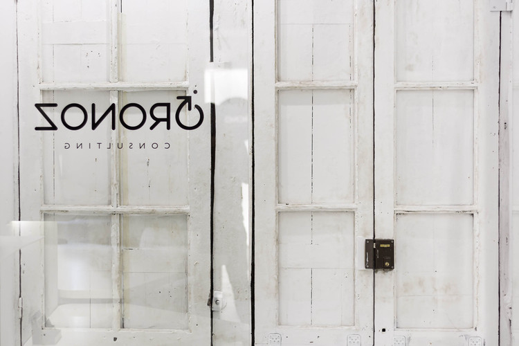
-In order to respect the original front facade the new glazed facade was set back 1m from the existing one.
-We did a main tour attached to the Stone wall from the entry to the end. We put the programme in the remaining space.
-The circulation area was generated at one side of the area next to the existing stone wall from the entrance to the back leaving the rest of it completely free.

-At the back a powerful artificial lighting was installed to try and create the feel of a patio plus with the idea to show the company logo which can be seen from the main street entrance.
-The lighting installation was designed very carefully as it was going to be switched on all day but at the same time it needed to create a good, natural working atmosphere.

We think that the challenge has been resolved in the best way. We have been able to mix the past and the contemporany languages together creating a co-existence between them to preserve the original character of the place.
All this makes us smile.


